You’ve probably heard a story like this before. A local business owner pays for a new website, waits weeks for the launch, and then feels a pang of disappointment when it finally goes live. It looks fine, but it’s not what they pictured. It doesn’t bring in the calls or bookings they were hoping for. The hidden reason often comes down to a vague brief. Most website disappointment starts long before a designer is even hired.
If you run a small local business, you can’t afford to learn this lesson the hard way. Whether you’re hiring website design services for the first time or you’re ready for a refresh, getting clear on what you need before you start is the secret to a smooth project. This post is your friendly guide to creating a simple, one-page brief that gets you the website you actually asked for. We’ll walk you through it step by step. You’ll learn why a vague brief costs you money, how to start with your business goal, and why you should describe your customer before you even think about design. We’ll also cover listing your must-have pages, taking stock of content, and the one-page brief you can fill in today. Let’s get started.
Why a Vague Brief Costs You Money Before the Designer Even Starts
Most website disappointment isn’t a bad designer. It’s a brief that said “modern and clean, like my competitor’s site” and never named what the site actually has to do.
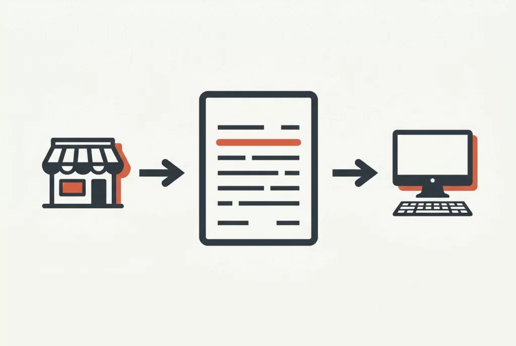
A brief is just one page that tells your designer what the site is for, who it’s for, what pages it needs and what content already exists. Colours come later.
Here’s the logic: if your designer doesn’t know the site’s purpose, they’ll guess. You’ll pay to build the guess, then pay again to fix it. That’s a sensible way of working, not a guarantee, but it stacks the odds in your favour.
Vague briefs also invite scope creep early. Every “oh, and could we also…” becomes a new conversation, a new quote and a longer wait.
Still weighing up whether to build it yourself? Our guide to the DIY website builder vs hiring a web designer trade-off for Australian small businesses is worth a read.
This article walks through the order that works: your goal, your customer, your must-have pages, the content you already have, then design preferences. The sequence is the point. First up: the goal.
Start With the Goal: Calls, Bookings or Enquiries
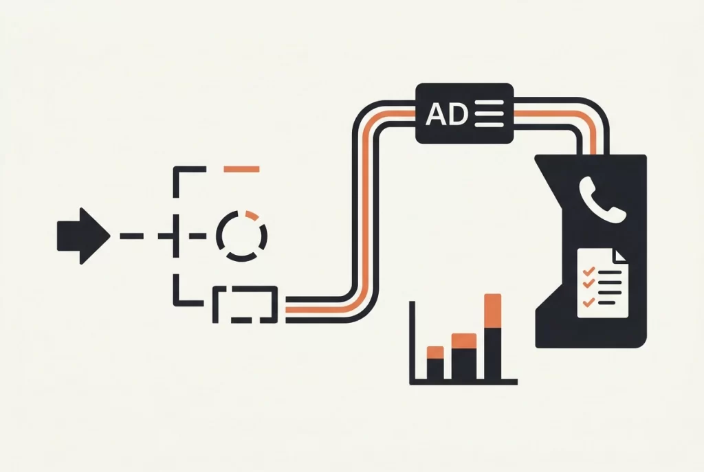
Alright, so you’ve got a blank page and you’re staring at it. Let’s fix that by starting where it actually matters: the one action your site exists to produce. Before you think about customers or pages, decide what you want someone to do. Then write it in the brief as a plain sentence: “The main job of this site is to get the phone ringing.”
It sounds almost too simple, but here’s what it does. A plumber writing “get emergency calls” builds a very different site to a physio writing “book appointments online.” A cafe wants table bookings and walk-ins. A salon wants online bookings, full stop. A trades business wants quote enquiries. Same tool, five different jobs.
And the job changes the build. Phone-first? Tap-to-call button at the top of every page. Booking-first? A dead simple form or booking link, nothing in the way. Enquiry-first? A clear form and a promise you’ll actually keep: “We reply within one business day.”
Here’s the trap: the five-goal brief. “We want calls, bookings, enquiries, newsletter sign-ups AND Instagram followers.” A site asked to do everything usually does nothing well. Pick one main goal. One optional secondary. That’s it.
Why bother? Because when you search website design for small business, the designers quoting fastest are the ones reading a clear outcome, not a vibe. You’ll get a sharper quote and a site that actually pulls its weight.
Try: “The main job of this site is to get quote enquiries through the contact form. Secondary: let people call us from their mobile.” Copy that into your brief and move on.
Describe the Customer You Are Trying to Reach
The goal is set. Now the brief needs to say who you’re actually talking to.
Forget marketing profiles. Write three or four lines about a real person: where they live, roughly how old they are, what they need and how they find you.
Define what “local” means
Most small local businesses serve a suburb or region. So say it plainly in the brief: who counts as local, and do you want enquiries from further away? A plumber happy to travel 30km has a different site to one covering three postcodes.
How they actually search
Picture them: phone in hand, searching Google, checking Google Maps reviews, or asking a neighbour for a recommendation. That tells your designer to prioritise tap-to-call buttons, a clear map and mobile-friendly pages. It shapes your wording too, so think about how they search when you write your Google Ads.
The description also sets the tone. A busy parent hunting a plumber at 7pm wants short sentences and a phone number, not clever copy.
Here’s a worked example:
- “Jess, 38, lives in [suburb], two kids, works full time.”
- “Burst pipe? She’s searching on her phone and wants someone local, today.”
- “She’ll click the first result with a phone number and good reviews.”
Now swap in your own customer details.
List the Must-Have Pages, and Be Honest About the Nice-to-Haves
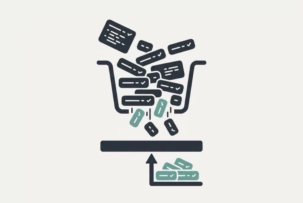
With your customer sorted, the page list usually writes itself. Most local business sites need only a handful of pages, and every extra page means more cost, more content to supply and more delay. Start with the usual shortlist: a home page, a services or menu page, an about page that builds trust, and a contact page with your phone number, address, opening hours and a map. If you offer a few main services, give each one its own page. A plumber might have separate pages for blocked drains, hot water repairs and bathroom renovations, so someone searching for one specific job lands on the right answer. For each page, write one line of purpose in the brief. If you are unsure about a page, mark it as a later addition rather than a launch requirement. You have permission to leave things off at launch: a smaller, finished site beats a bigger, half-finished one every time. For a fuller page-by-page checklist, see What Should a Small Business Website Actually Include? An Australian Owner’s Checklist.
Take Stock of the Content You Already Have
Pages are settled. Now open a folder and take an honest look at what you already own: logo files, photos you own, service descriptions, price lists, testimonials, before-and-after shots and any printed brochures.
Mark each item in the brief as ready to use, needs a tidy up, or doesn’t exist yet. This stops anyone promising content that isn’t there. Missing content is the usual suspect behind a stalled project, so name who is creating it: you, the designer, or a photographer. If you want the designer to write your words or take new photos, agree that up front so it’s quoted, not assumed.
Put everything in one shared folder or drive and link it in the brief. Otherwise your designer will spend a fortnight chasing photos over text message. If writing feels like the blocker, this content framework for local businesses can help you find the words.
Why Design Preferences Come Last, Not First
Once you’ve been honest about your content, you’ve done the hard yards. The goal, customer, pages and content are all sorted. So now you can finally talk design, right?
Almost. Design preferences should still come last, and here’s why. Colours, fonts and layouts are answers to questions you haven’t asked yet. Decide the look first and you lock yourself into a site that looks great and does nothing.
A goal and a customer description actually produce design decisions on their own. A phone-first business needs a big, tappable phone number on every page. A salon needs a booking button above the fold, where people see it without scrolling.
When you do add design input, keep it useful. List two or three sites you like, and one sentence on what you like about each: clear layout, easy to find prices, obvious booking button. Competitor sites are fine as a reference, but say what you like rather than asking anyone to copy them. Never lift their words or images.
Instead of taste, use this space for the practical bits: your existing branding, colours to avoid, any signage or vehicle wrap the site needs to match, and accessibility needs like larger text for older customers. On that last point, body text should hit a contrast ratio of at least 4.5:1 against its background so it stays readable.
Next, let’s put all of this onto one page.
The One-Page Brief You Can Fill In Today
So design notes sit at the bottom. Here’s all of it as one template you can fill in today. Keep it to one page. A one-page brief gets read; a six-pager gets skimmed, and a skimmed brief is how you end up paying for the wrong website.
Goal (one sentence): “The main job of this site is to get the phone ringing” (or bookings made, or quote enquiries). Add a second line only if there’s a genuine secondary action.
Customer (three lines): Who they are, roughly where they’re coming from, and how they find you. Google search, Google Maps, a neighbour’s recommendation.
Pages (one line of purpose each): List them, then mark each one launch or later. Not sure? It’s later.
Content: Three quick lists. What you already have, what needs fixing, and who’s creating what’s missing.
Design notes (last, always): Two or three sites you like with one sentence on why, plus anything you want avoided.
Practical extras (one line each):
- Rough budget range in dollars
- Ideal timing for launch
- Who makes the final call on decisions
- Who owns the domain, hosting and logins, so nobody gets locked out
If it doesn’t fit on the page, you’re padding rather than planning. Cut a page to “later” instead.
Still one page? That’s the lot. Half an hour’s work, and you’ve got something a designer can quote from, brief a project on, and actually deliver against.
What to Do Next Once Your Brief Is Written
Once your one-page brief is done, send it over before you ask for a quote. Then invite questions back. A designer who responds with thoughtful questions is engaging with your goal, not just pricing a job, and that’s a good early sign.
Before you hire anyone, ask three things: how changes to scope are handled, how you’ll be able to update the site yourself, and who owns the finished site once it’s built.
It’s also worth comparing website design services on how well they understand local, small business realities, not just on the lowest quote. If a designer gets that a plumber needs after-hours calls or a salon needs online bookings, you’ll spend less time explaining the basics. As an example, epikmonkey.com.au works with small to medium local businesses and offers website design alongside other digital services, so a brief like the one you’ve written fits how they already work.
Finally, remember that a clearer brief usually means fewer revision rounds and shorter timelines. That’s where the real time and money savings come from, not from shaving a bit off the quote.
Your Brief Is the Cheapest Part of the Project
It all comes down to this. The order that works is goal, customer, must-have pages, existing content, then design preferences. Each one answers a question the next depends on, so nothing gets guessed.
Three actions will get you most of the way: write your goal in one sentence, list your pages with a purpose each, and take an honest inventory of the content you already have. That’s it.
Here’s the part worth sitting with: the brief is free to write and takes about half an hour. It’s the best-value part of the whole project, and it’s what keeps the quote honest, as our breakdown of what a small business website actually costs in Australia shows.
And the reassurance you might need: good designers want a clear brief. It makes their job easier too. They’re not after a blank canvas. They’re after direction.
Conclusion
A strong brief comes down to four things: lead with your goal, describe your customer, list your pages with a purpose, and take stock of what you already have. Design preferences come last because everything else shapes them.
The value is straightforward. A clearer brief means fewer revision rounds, shorter timelines and a quote that actually holds up. It takes about half an hour to write and costs nothing, yet it’s the part of the project that saves you the most.
Your next step is simple: download the one-page brief template from epikmonkey.com.au and fill it in today. Good designers want direction, not a blank canvas, so give them yours and watch the whole project get easier.